
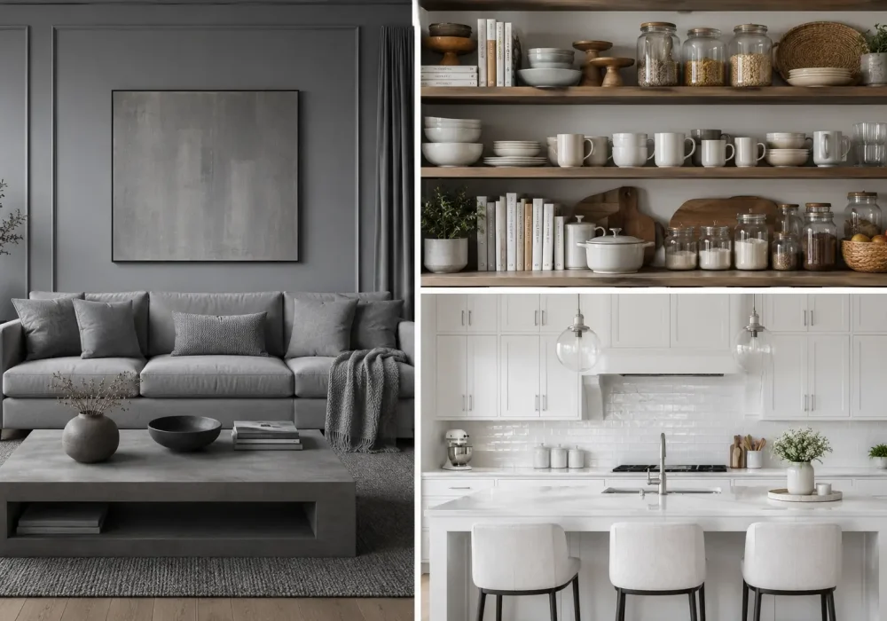
Home decor rarely falls out of style overnight. More often, the pieces and finishes we once loved slowly start feeling less exciting as interiors move toward fresher ideas.
This year, that shift is especially noticeable. Some familiar looks are beginning to feel overly coordinated, overused, or simply disconnected from the warmer and more personal homes people want today.
That doesn’t mean your home needs a complete makeover. Knowing which trends are fading can help you make smarter updates while keeping the pieces that still feel right for your space.
The Outdated Home Decor Trends
From once dominant color palettes to familiar furniture choices and decorative details, these 14 trends show how quickly our idea of a stylish home can evolve. Some have simply been overdone, while others are being replaced by more thoughtful, character filled alternatives that feel easier to live with and more enduring.
Also Read: 17 Cubicle Decor Ideas to Inspire Your Best Workspace
Also Read: 12 Slanted Ceiling Ideas That Transform Ordinary Interiors
1. All Gray Interiors Are Starting to Lose Their Warmth
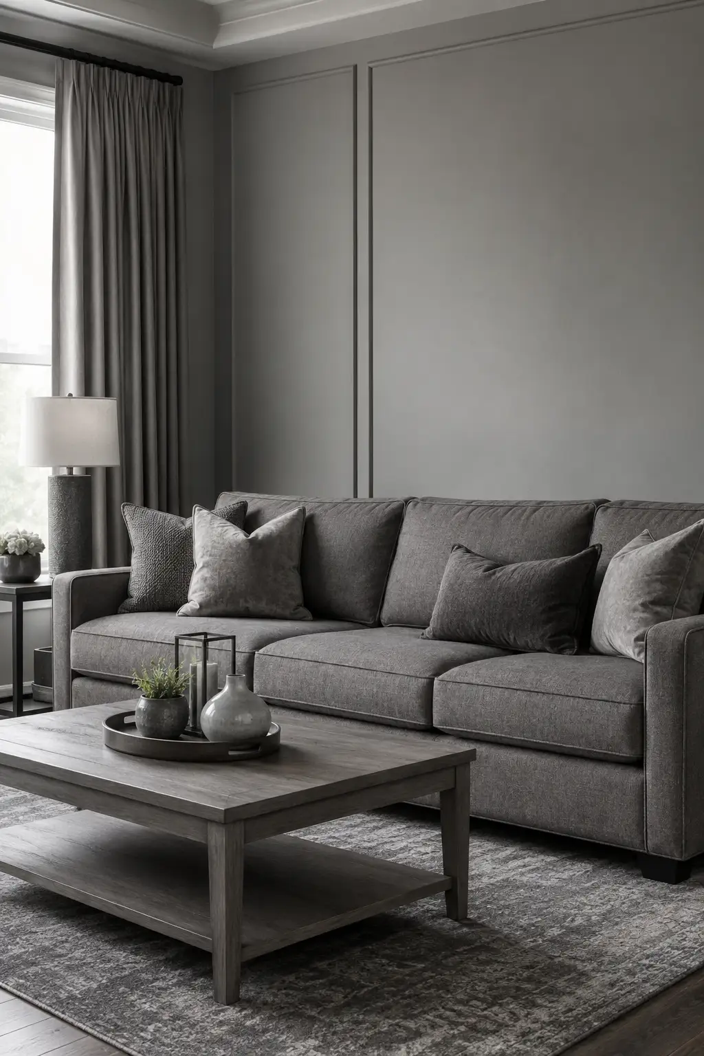
For years, gray was treated as the ultimate safe choice for a polished home. Gray walls, sofas, curtains, rugs, and furniture could create a neat and coordinated space. After being used so heavily, however, the all gray look is beginning to feel more connected to an earlier decorating era than a fresh interior.
The problem becomes clearer when nearly every surface shares the same cool undertone. Without enough contrast, an otherwise beautiful room can feel flat and visually heavy. Even expensive furniture may lose some of its impact when the walls, upholstery, textiles, and accessories all blend into similar shades of gray.
Warmer neutrals are bringing more depth and character into current interiors. Cream, taupe, mushroom, camel, warm white, and natural wood can soften an existing gray palette beautifully. You don’t necessarily need to remove gray altogether, but giving it warmer colors and richer textures to work alongside can make a noticeable difference.
Pro Tip: If you already have a gray sofa, keep it and layer in warm cream pillows, textured throws, natural wood, and a softer rug. A few thoughtful changes can make gray feel intentional again rather than overly dominant.
2. Rustic Barn Doors Are Losing Their Place in Modern Homes
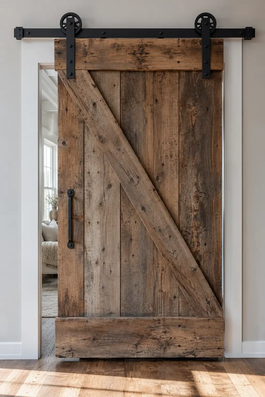
Sliding barn doors once brought instant farmhouse character to interiors, especially when paired with reclaimed wood and bold black hardware. Their oversized tracks and weathered finishes made them a statement feature. After years of appearing in bedrooms, bathrooms, pantries, and living spaces, the look is beginning to feel overly familiar.
There is also a practical reason homeowners are moving away from them. Because barn doors slide in front of an opening rather than sealing it, they usually offer less privacy and sound control than a traditional door. Their exposed rails and bulky hardware can also compete with cleaner architectural details in a more refined interior.
Current spaces are favoring doors that feel integrated into the architecture rather than added as a decorative feature. Pocket doors, streamlined wood doors, fluted glass panels, and simple painted designs can provide character without dominating the wall. They also tend to work more naturally across a wider range of interior styles.
Pro Tip: If you love the warmth of a wooden barn door, keep the natural wood idea but simplify the silhouette. A clean wood pocket or hinged door can preserve that texture while giving the doorway a more timeless finish.
3. Inspirational Word Art Walls Are Starting to Feel Overdone
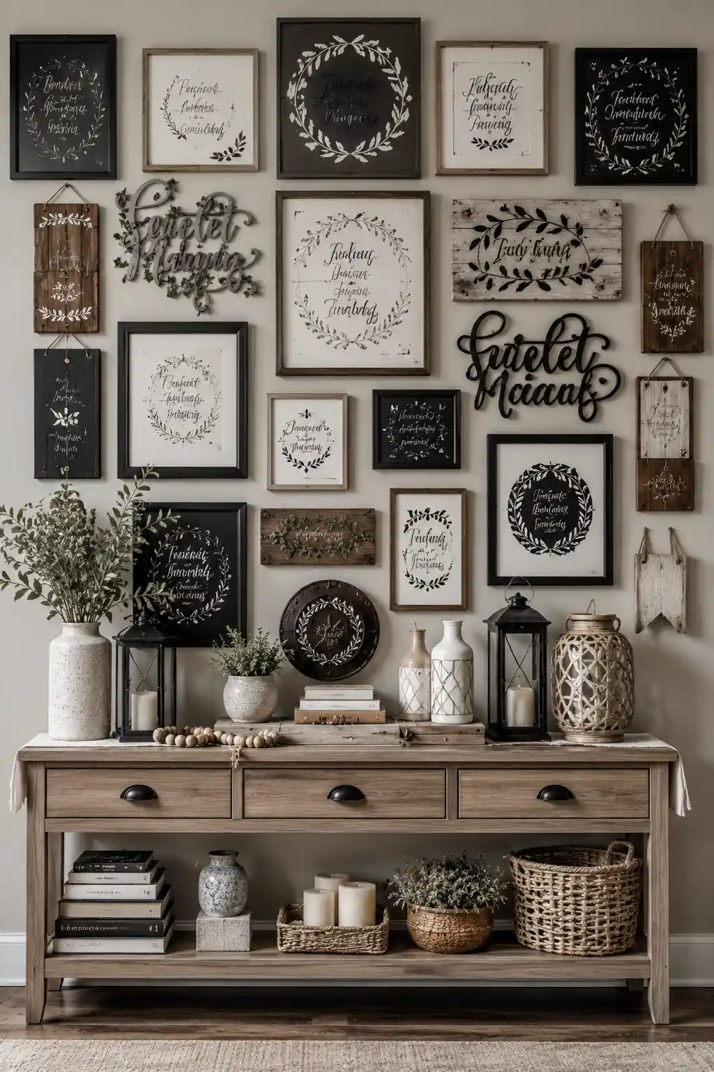
There was a time when framed quotes, cursive sayings, and inspirational signs brought an easy personal touch to blank walls. As the look grew more popular, however, entire gallery walls became filled with phrases, wooden plaques, and decorative lettering. What once felt charming can now make a space look busy and overly themed.
The main issue is repetition. When nearly every frame contains another quote or scripted message, the eye has nowhere to rest and individual pieces lose their impact. Mixing several fonts, frame styles, wooden signs, and metal lettering can add even more visual noise, particularly when the display covers most of a wall.
A more current approach is to treat wall decor like a collected gallery rather than a collection of sayings. Original artwork, photography, vintage prints, sketches, and textured pieces can bring far more personality to a room. Leaving some open wall space also allows the pieces you truly love to stand out.
Pro Tip: You don’t have to remove every meaningful quote. Keep one favorite piece and surround it with artwork, photographs, or vintage prints so the message becomes an intentional accent rather than the entire decorating theme.
4. Industrial Pipe Furniture Is Starting to Feel Too Heavy
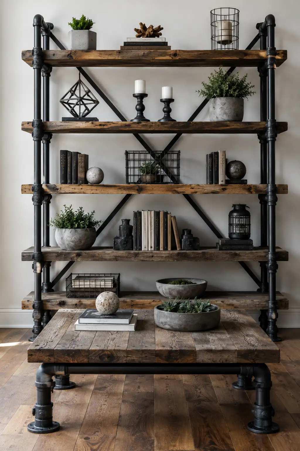
Industrial furniture once brought a bold, urban edge into everyday interiors. Thick reclaimed wood paired with black plumbing pipes, exposed joints, and metal brackets created a rugged look that felt refreshingly different. After years of widespread use, these oversized industrial details can now make a room feel heavier than intended.
The strongest versions of this trend often combine several industrial elements at once. Pipe shelving, chunky wood tables, wire baskets, black metal accessories, and dark finishes can quickly dominate a space. Instead of adding character, too many hard materials can leave an interior feeling more like a themed loft than a naturally collected home.
The newer approach still welcomes metal and wood, but in a much more restrained way. Slim metal frames, refined wood finishes, sculptural furniture, and softer silhouettes provide contrast without overwhelming the room. Mixing these pieces with comfortable textiles and warmer materials also creates a more balanced, sophisticated result.
Pro Tip: Keep the reclaimed wood if you love its character, but replace bulky pipe bases and exposed fittings with slimmer metal or simple wood supports. You’ll preserve the texture while giving the furniture a lighter, more current presence.
5. Overcrowded Open Shelves Are Creating More Clutter Than Charm
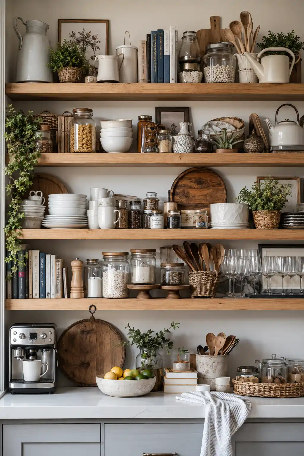
Open kitchen shelving once felt like a refreshing alternative to rows of closed cabinets. Everyday dishes, glass jars, cookbooks, cutting boards, and ceramics could become part of the decor. But when nearly every inch of shelving is filled, that casual collected look can quickly turn into visual overload.
The problem isn’t open shelving itself, but the temptation to display everything at once. Layers of mugs, bowls, jars, plants, baskets, appliances, and decorative objects leave very little breathing room. Even when every item is attractive on its own, the overall arrangement can make a kitchen feel busier and smaller.
A more refined approach treats open shelves as carefully edited display space. Keeping everyday essentials within easy reach while storing less attractive items behind cabinet doors creates a calmer balance. Fewer objects, repeated materials, and intentional gaps also allow beautiful ceramics and cookware to receive the attention they deserve.
Pro Tip: Remove about a third of what is currently displayed and group similar pieces together. Leaving a little open space between collections can make existing shelves look more polished without replacing a single thing.
6. Tiny Mosaic Backsplashes Are Making Kitchens Feel Busier
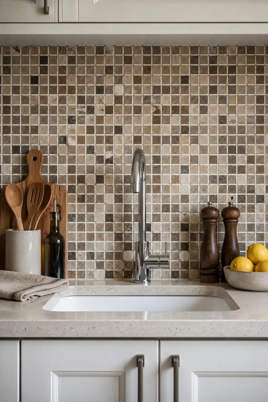
Small mosaic backsplashes once seemed like an easy way to bring texture and detail into a kitchen. Rows of tiny stone, glass, or ceramic squares added plenty of pattern without requiring a bold color. Today, all those small tiles and visible grout lines can make the backsplash feel busier than the rest of the space needs.
Mixed beige, brown, cream, and gray mosaics can be especially difficult to work with because they introduce several tones at once. Instead of creating a quiet backdrop for cabinetry and countertops, the backsplash becomes another competing surface. In smaller kitchens, that repeated pattern can make the wall feel even more visually crowded.
Larger and simpler surfaces are giving kitchens a cleaner, more considered appearance. Oversized tiles, handmade look ceramics, vertically stacked tiles, and continuous slab backsplashes offer texture with fewer interruptions. These choices can also let beautiful countertops, cabinetry, and hardware take a stronger role in the overall design.
Pro Tip: If replacing your mosaic backsplash isn’t practical yet, keep the surrounding countertop styling minimal. Fewer accessories and a restrained color palette can quiet the pattern until you’re ready for a larger update.
Also Read: 14 Craft Room Storage Ideas That Make Supplies Easy to Find
7. Heavy Window Treatments Are Overwhelming the View
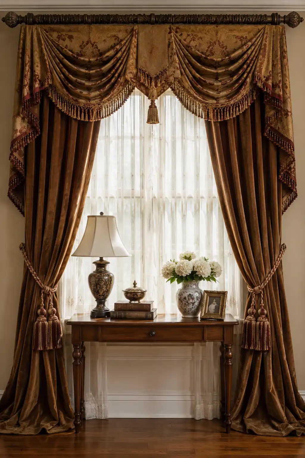
Elaborate valances, layered drapes, tassel trim, and ornate curtain rods once gave windows a formal, luxurious finish. These treatments were designed to become a decorative feature of their own. In many homes today, though, all that fabric can feel visually heavy and pull attention away from the architecture and natural light.
The combination of thick curtains, swagged valances, decorative fringe, and oversized tiebacks can make even a generous window appear smaller. Dark fabrics can add even more visual weight, especially when they extend across much of the wall. Instead of framing the view, the treatment can end up becoming the first thing you notice.
Current window styling tends to feel lighter and more intentional. Full length linen curtains, simple pleated panels, tailored Roman shades, and understated rods can still make a window look finished without overwhelming it. Hanging curtains higher and allowing more glass to remain visible can also make the room feel taller, brighter, and more open.
Pro Tip: Before replacing everything, remove the valance, tassels, and decorative layers first. Keeping a pair of simple floor length curtain panels may be all it takes to give the same window a cleaner and more refined appearance.
8. Overdone Farmhouse Decor Is Losing Its Easygoing Charm
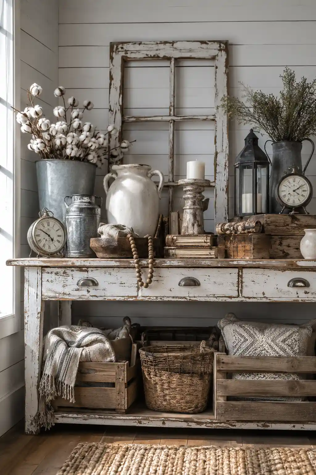
Farmhouse style became popular because it made homes feel comfortable, familiar, and relaxed. Distressed furniture, shiplap walls, galvanized metal, cotton stems, rustic clocks, and weathered accessories all helped create that cozy character. Once too many of these recognizable details are brought together, however, the room can start to feel themed rather than naturally collected.
The heavily distressed finish is one element that can make the look feel especially dated. Chipped white paint, faux aged wood, vintage style lanterns, old window frames, and decorative crates all competing in one area can overwhelm the genuine beauty of rustic materials. The result often feels more staged than personal.
Farmhouse style doesn’t need to disappear completely. A more refined interpretation focuses on honest materials such as aged wood, linen, handmade pottery, woven baskets, and simple vintage pieces. Using these elements selectively creates warmth and character without making every corner announce the same decorating style.
Pro Tip: Choose one or two farmhouse pieces with real character and remove the overly distressed accessories around them. Pairing aged wood with cleaner furniture and simple textiles will make rustic details feel far more intentional.
9. Cheap Fast Furniture Rarely Ages as Gracefully as Expected
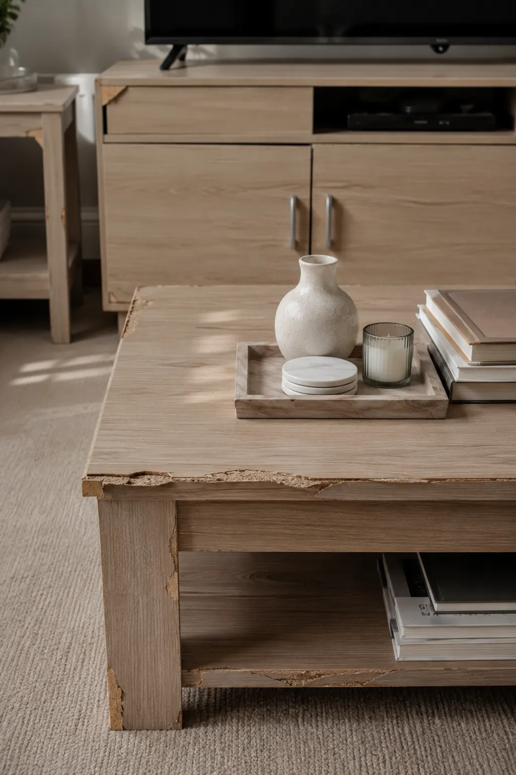
Budget friendly furniture can be tempting when you want to furnish a room quickly, especially when the design looks stylish at first glance. The problem often appears after regular use. Thin veneers, particle board, weak joints, and inexpensive finishes can start showing chipped corners, peeling edges, scratches, and loose hardware much sooner than expected.
Once those small signs of wear appear, they can affect the impression of the entire room. A damaged coffee table or sagging cabinet draws attention even when everything around it is beautifully styled. Replacing inexpensive pieces repeatedly can also make decorating feel less practical than investing carefully in fewer, better made essentials.
A more considered home doesn’t require every piece to be expensive. Mixing quality new furniture with vintage finds, restored pieces, and solid wood basics can create a far richer interior. Prioritizing construction and materials for hardworking pieces such as tables, dressers, and seating usually pays off most over time.
Pro Tip: Spend more on furniture you touch and use every day, then save on decorative accessories that are easier to change. A sturdy table or cabinet with a timeless shape can anchor a room for years.
10. Perfectly Matching Furniture Sets Are Losing Their Polished Appeal
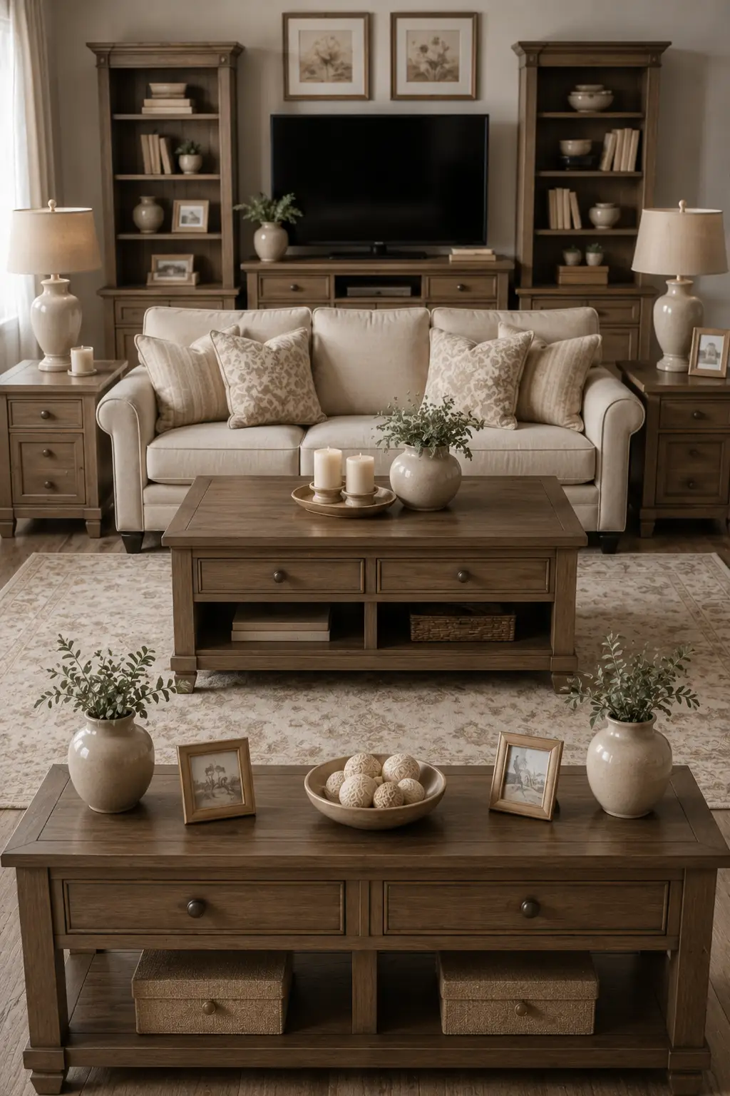
Matching furniture sets once made decorating feel simple and foolproof. A coffee table, side tables, media console, bookcases, and storage pieces in the exact same finish created instant coordination. While the room may look orderly, too much matching can also make it feel more like a furniture showroom than a home shaped over time.
The issue becomes more noticeable when the same wood tone, hardware, shape, and detailing repeat across nearly every piece. Add matching lamps and symmetrical accessories, and there is little visual surprise left in the room. Even beautiful furniture can lose its individuality when everything belongs to one coordinated collection.
More layered interiors mix pieces that complement one another without being identical. A wood coffee table might sit beside a slimmer metal side table, while a vintage cabinet introduces another finish entirely. Varying shapes, materials, and periods gives a room depth while a consistent color palette keeps everything feeling connected.
Pro Tip: Don’t replace a matching set all at once. Start by swapping just one prominent piece, such as the coffee table or side tables, for something with a different material, shape, or finish to break up the showroom effect.
11. Chevron Patterns Are Losing Their Once Bold Impact
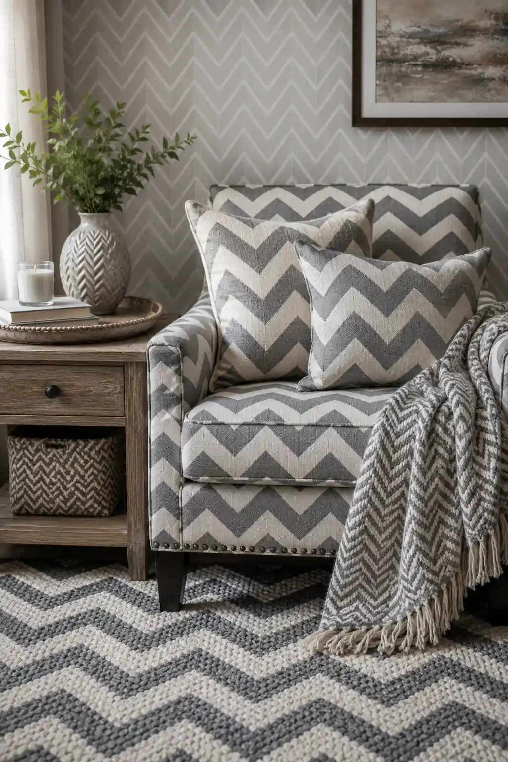
Chevron once brought instant energy to interiors with its sharp zigzag pattern and graphic contrast. It appeared everywhere from rugs and wallpaper to accent chairs, pillows, curtains, and throws. After becoming such a recognizable decorating signature, the pattern can now make a room feel tied to an earlier trend cycle.
The effect becomes especially noticeable when chevron appears on several surfaces at once. A patterned chair paired with matching pillows, wallpaper, rugs, and textiles leaves little room for quieter details to balance the space. Instead of creating a statement, repeating the same zigzag motif can make the entire arrangement feel overly coordinated and visually restless.
Pattern still has an important place in a stylish home, but softer and less predictable designs are taking the lead. Subtle stripes, small scale geometrics, botanical motifs, irregular patterns, and richly textured solid fabrics can add interest without defining the entire room. Mixing different scales also creates a more collected and sophisticated look.
Pro Tip: If you already own a chevron chair or rug, let it be the only strong zigzag pattern in the area. Surround it with solid fabrics and quieter textures so it reads as an intentional accent rather than a repeated theme.
12. Rose Gold Everywhere Is Losing Its Luxe Appeal
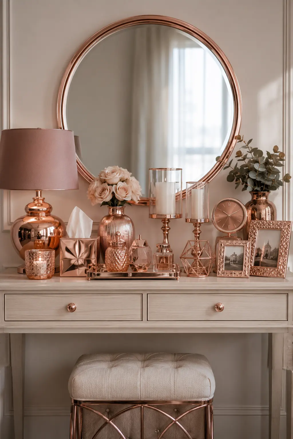
Rose gold once felt like a fresh alternative to traditional silver and gold finishes. Its warm pink tone quickly found its way onto mirrors, lamps, picture frames, candle holders, trays, clocks, and decorative accessories. When used across nearly every object, though, the finish can make a space feel more trend driven than genuinely luxurious.
The biggest issue is repetition. A rose gold mirror paired with matching lamps, vases, frames, hardware, and tabletop accessories leaves little variation for the eye. The metallic finish becomes the theme of the room rather than a thoughtful accent, and its original sense of glamour can quickly get lost.
Interiors are moving toward a more collected mix of metals and finishes. Aged brass, antique bronze, satin nickel, and darker metals can sit comfortably alongside one another when repeated with restraint. This layered approach feels richer because no single finish has to dominate every decorative detail.
Pro Tip: You don’t need to remove every rose gold accent. Keep one or two pieces you genuinely love, then introduce aged brass, wood, ceramic, or darker finishes nearby to create a more balanced and sophisticated mix.
13. Too Many Faux Plants Are Making Greenery Feel Less Natural
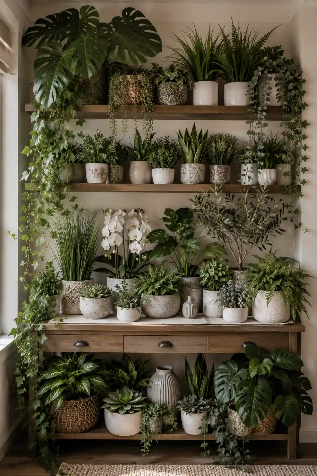
Artificial plants became popular because they offered an easy way to bring greenery into rooms without watering, pruning, or worrying about sunlight. A convincing faux stem or plant can still work beautifully in the right spot. The look starts to lose its appeal when shelves, tables, and entire corners are packed with imitation greenery.
Using too many faux plants can create the opposite effect of what greenery is meant to achieve. Repeated plastic leaves, perfectly shaped vines, artificial succulents, and oversized tropical foliage can make a display feel staged rather than fresh. When every available surface holds another plant, individual pieces also lose their decorative impact.
A more refined approach mixes greenery with other natural textures and leaves enough space for each element to stand out. A few real plants suited to your home’s light conditions can be combined with carefully chosen faux stems where maintenance is difficult. Wood, stone, ceramics, branches, and fresh seasonal clippings can provide additional natural character without filling the room with leaves.
Pro Tip: Keep your most realistic faux plants and remove the repetitive smaller ones. Grouping one or two convincing plants with pottery, books, or natural wood will create a calmer display that feels much more intentional.
14. All White Kitchens Are Starting to Feel Too One Note
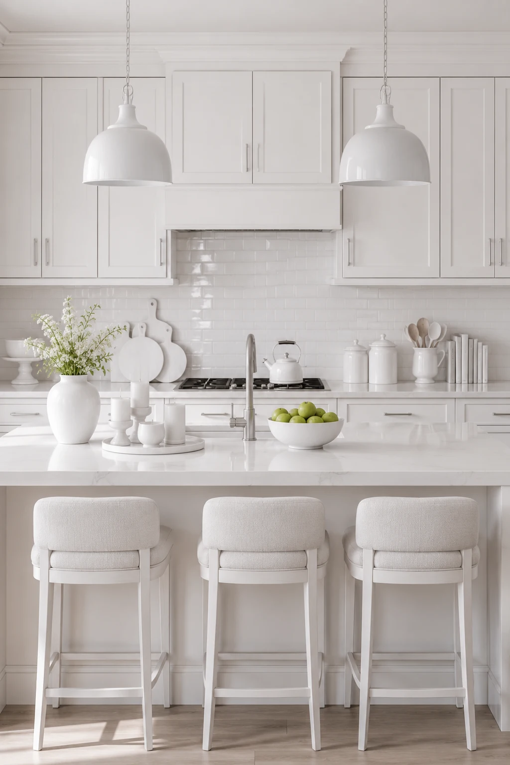
For years, the all white kitchen represented everything clean, bright, and timeless. White cabinets, countertops, backsplashes, pendant lights, stools, and accessories created an effortless sense of order. After dominating kitchen design for so long, though, completely white spaces are beginning to feel less distinctive and more predictable.
The issue isn’t white cabinetry itself. It’s when every surface shares nearly the same color and finish, leaving little contrast for the eye to appreciate. Without natural wood, deeper tones, varied textures, or warmer materials, even a beautifully finished kitchen can feel sterile rather than welcoming and personal.
White kitchens are now taking on more character through thoughtful layers rather than complete redesigns. Warm wood stools, aged brass hardware, textured ceramics, statement lighting, earthy colors, and contrasting islands can instantly add depth. White can remain the foundation while richer materials give the space a more collected identity.
Pro Tip: Keep your white cabinets and countertops, then introduce contrast through just two or three elements. Warm wood seating, distinctive pendant lights, or darker hardware can give an all white kitchen fresh dimension without sacrificing its bright appeal.
Final Thoughts
The biggest lesson from these fading trends isn’t that every gray sofa, barn door, white kitchen, or farmhouse accessory suddenly needs to go. A home feels dated when a once popular idea is repeated so heavily that it begins to define the entire space. Editing what you already own and introducing contrast, texture, warmth, and more personal pieces can often make a bigger difference than starting over.
Instead of chasing every new decorating trend, focus on creating a home that feels collected over time. Choose materials you genuinely enjoy, mix old and new pieces, leave room for individual objects to stand out, and make updates gradually. Trends will continue to change, but a thoughtful interior with personality has a much better chance of looking beautiful long after the latest decorating craze has passed.
