
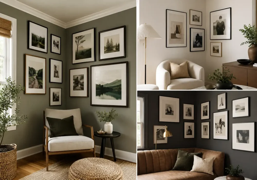
An empty corner can easily become one of the most overlooked parts of a room. With the right artwork and arrangement, though, it can become a striking feature that adds personality and visual interest.
A corner wall gallery offers more than a place to hang pictures. When artwork continues across two adjoining walls, it creates depth, movement, and a stronger connection between the different areas of a room.
From carefully aligned frames to eclectic art collections, the right arrangement can make even a quiet corner feel intentional and beautifully finished. These ideas show how to make that transformation work in a stylish, considered way.
Artful Corner Wall Gallery Ideas to Transform Your Space
These corner wall gallery ideas cover a range of sophisticated approaches, from clean and structured frame layouts to layered collections with more personality. Each one shows how artwork, spacing, frame choices, and surrounding furniture can work together to give an overlooked corner a polished presence.
Also Read: 12 Window Trim Ideas Worth Considering for Your Next Update
Also Read: 14 Kitchen Wall Art Ideas to Give Blank Walls New Life
1. Create a Balanced Gallery That Wraps Around the Corner
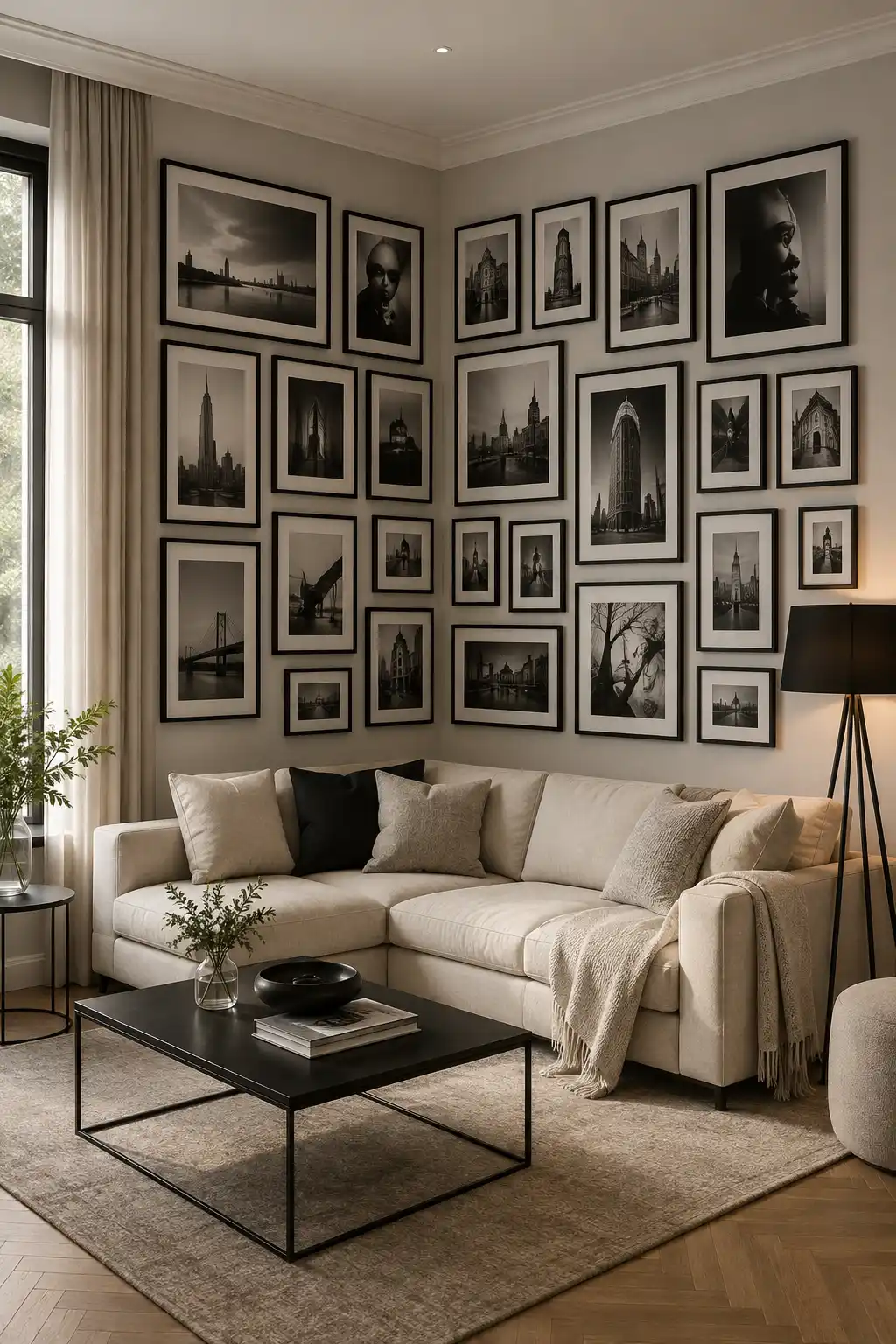
A corner becomes much more interesting when artwork is allowed to continue naturally across both adjoining walls. This arrangement uses the corner as the visual center, while the framed pieces spread outward to create a cohesive gallery. The result feels intentional and gives the seating area a strong focal point without overwhelming the room.
Using mostly black frames keeps the collection visually connected, even though the artwork varies in size and orientation. Larger photographs provide strong anchors, while smaller frames fill the spaces between them and create a layered, collected appearance. Keeping the artwork in a restrained monochromatic palette also helps the gallery feel polished and sophisticated.
The arrangement works particularly well above an L-shaped or corner sofa because the artwork follows the shape of the furniture below it. Rather than leaving one wall empty, extending the gallery around the corner makes the entire seating area feel more complete. Soft neutral furniture and simple accessories allow the artwork to remain the star of the room.
Pro Tip: Begin by positioning your largest artwork near each wall’s main visual anchor, then fill the surrounding spaces with smaller frames while keeping the gaps between pieces consistent.
2. Fill Tall Corner Walls With a Floor-to-Ceiling Art Collection
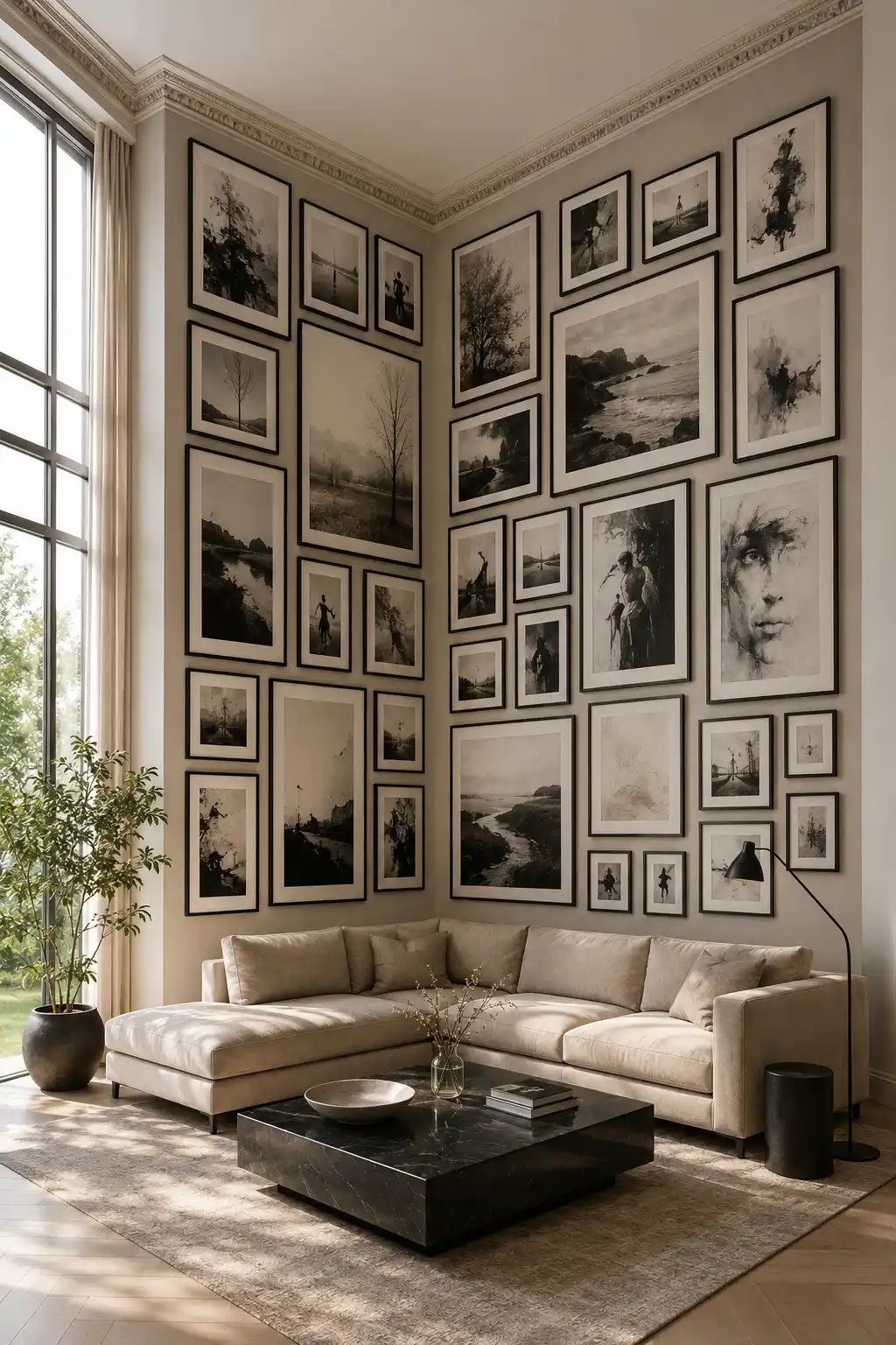
Tall walls give you an opportunity to make a corner gallery feel dramatic and substantial. Instead of keeping the artwork concentrated around eye level, extend the arrangement upward and downward to take advantage of the room’s full vertical height. This approach works especially well in rooms with high ceilings or large architectural windows.
Use a combination of oversized landscape artwork, tall portrait frames, and smaller pieces to create a layered composition. Keeping the frames in a consistent finish, such as black, helps connect the different sizes and prevents the wall from feeling visually scattered. A restrained palette of photography, sketches, and neutral artwork can also make a large collection feel more refined.
The key is to build the gallery around the proportions of the room rather than simply adding more frames. Leave enough space around architectural details such as the ceiling trim and windows, while allowing the artwork to visually follow the height of the corner. Paired with a low-profile sectional and simple furniture, the arrangement can turn an ordinary corner into a dramatic art-focused focal point.
Pro Tip: Place your largest artwork first, then build the smaller frames around it so the gallery has clear visual anchors instead of looking randomly filled.
3. Anchor the Gallery With One Oversized Statement Artwork
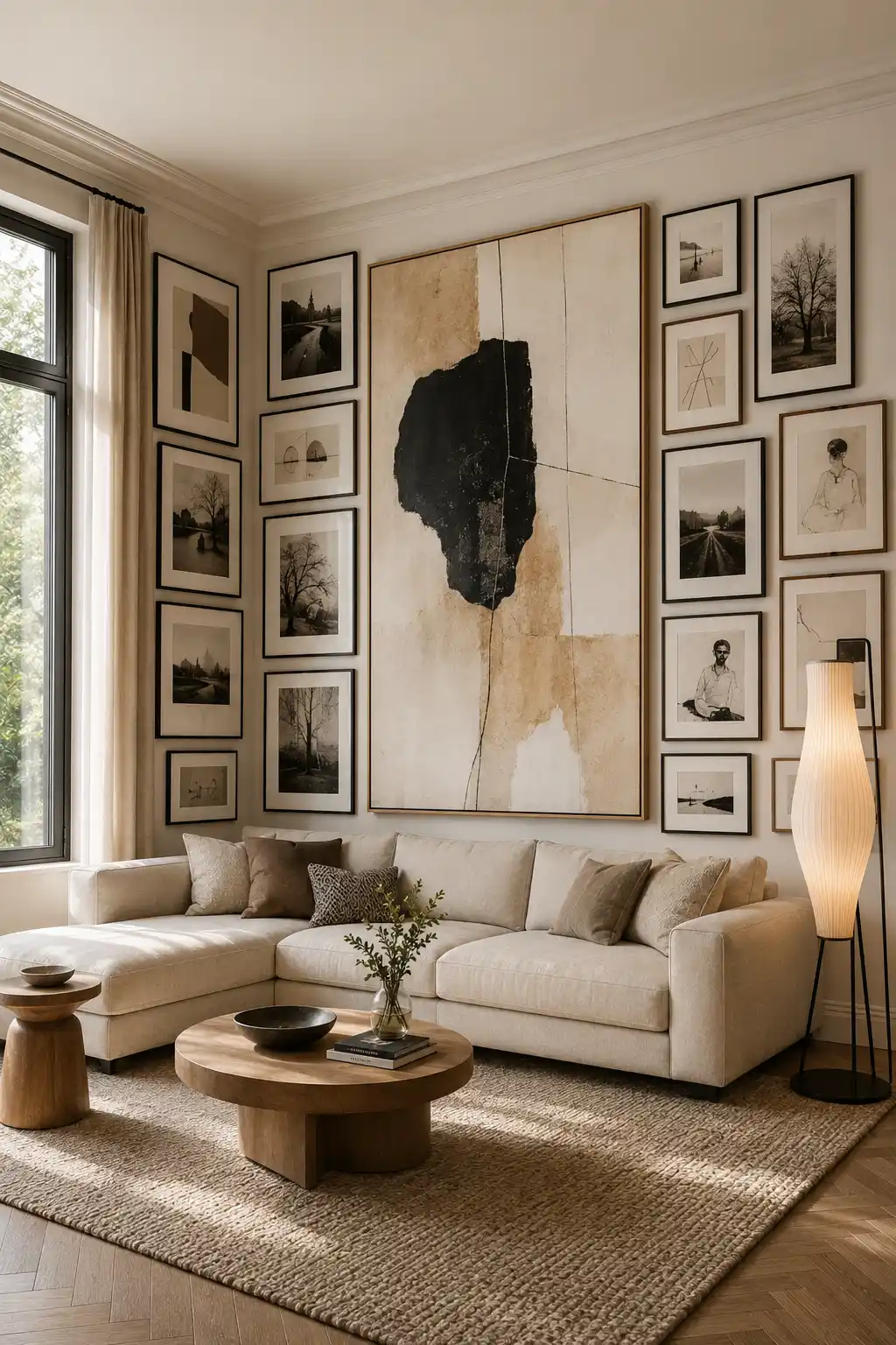
An oversized artwork can give a corner gallery a clear focal point while the surrounding frames add depth and personality. Instead of giving every piece equal visual weight, make one large painting the centerpiece and arrange smaller works around it. This creates an intentional hierarchy that immediately draws the eye toward the main artwork.
For a sophisticated result, choose a statement piece with colors that already appear elsewhere in the room. In this example, the warm beige, cream, and charcoal tones connect naturally with the sofa, rug, and wooden furniture. Smaller photographs and sketches then support the centerpiece without competing with it.
This approach is especially effective when the corner sits behind a sectional or another substantial piece of furniture. The oversized artwork visually anchors the seating area, while the smaller frames extend the composition across both walls. Keeping the surrounding artwork relatively restrained makes the main piece feel even more impactful.
Pro Tip: Choose the oversized artwork first and use its color palette to guide the frames and smaller artwork around it.
4. Build a Calm Neutral Gallery With Layered Textures
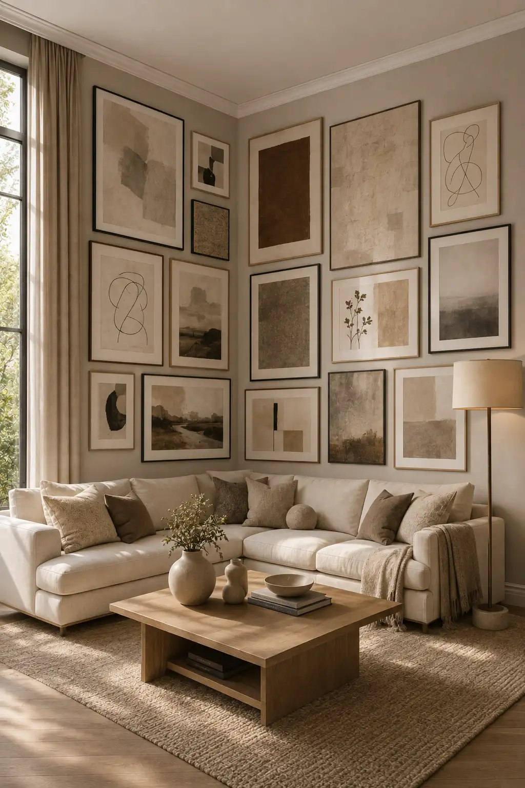
A neutral corner gallery can bring a sophisticated sense of calm to a living room without making the walls feel plain. Instead of relying on bold colors, combine soft beige, cream, taupe, warm brown, and muted charcoal artwork to create a subtle but visually rich collection. This approach works beautifully in spaces with natural light and warm furnishings.
Mix different artistic styles while keeping the overall palette consistent. Abstract compositions, delicate line drawings, muted landscapes, botanical details, and textured prints can sit together without competing for attention. Using both black and light wood frames adds enough contrast to define each piece while maintaining the relaxed character of the room.
The furniture can reinforce the same understated palette through soft upholstery, natural wood, woven textures, and simple ceramic accessories. When these elements echo the colors found in the artwork, the gallery feels integrated into the room rather than simply placed on the wall. The result is an elegant corner that feels refined, comfortable, and timeless.
Pro Tip: Pick two or three dominant neutral tones from your room and repeat them throughout the artwork to create a naturally cohesive gallery.
5. Bring Nature Indoors With a Botanical Corner Gallery
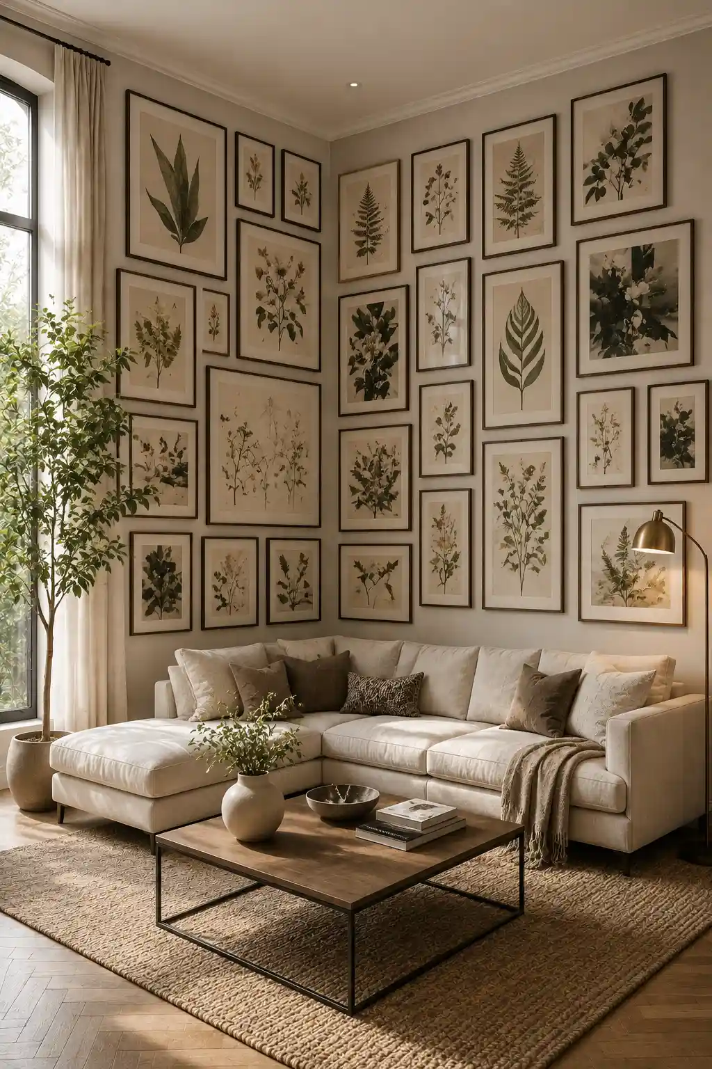
Botanical artwork can give a corner gallery a fresh and timeless character without making the room feel overly decorative. A collection of leaves, branches, flowers, and botanical studies creates a natural visual rhythm across both walls. The repeated organic shapes also soften the straight architectural lines of the corner.
For a cohesive look, choose botanical prints that share similar paper tones, frame finishes, or muted green and earthy colors. Mixing large leaf illustrations with smaller plant studies keeps the arrangement interesting while maintaining a clear theme. Different frame sizes can add movement without making the collection feel disorganized.
A real indoor tree or leafy plant placed beside the gallery can strengthen the connection between the artwork and the room. Keep the surrounding furniture relatively simple so the botanical collection remains the main feature. Warm natural light can also bring out the subtle greens, browns, and paper textures throughout the arrangement.
Pro Tip: Repeat one or two botanical colors in your cushions, rug, or accessories to make the artwork feel naturally connected to the rest of the room.
Also Read: 13 Easy DIY Wall Art Ideas to Transform Blank Walls Today
Also Read: 14 Creative Wall Decor Ideas to Upgrade Any Modern Interior
6. Mix Frames and Artwork Styles for a Collected Look
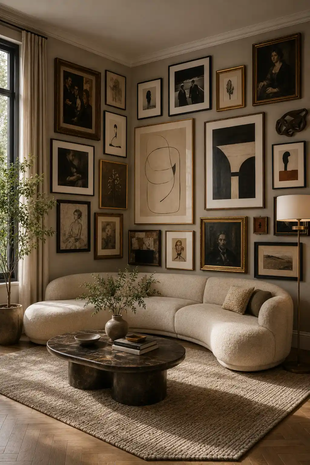
A corner gallery doesn’t have to follow one strict frame style to look sophisticated. Mixing black, dark wood, and subtle gold frames can give the arrangement the character of a collection built over time. The important part is creating enough repetition so the variety still feels intentional.
Combine different types of artwork, such as portraits, abstract compositions, sketches, photography, and small decorative pieces. Let one or two larger artworks act as visual anchors, then use smaller frames to build interest around them. Keeping the artwork within a controlled palette of neutral, brown, charcoal, and muted tones prevents the arrangement from becoming overwhelming.
This style works particularly well in a comfortable living room where the gallery can feel personal rather than overly formal. A curved sofa, textured rug, warm lighting, and natural accessories can soften the mixture of frames and artwork. When everything is balanced properly, the corner feels like a thoughtfully assembled collection rather than a perfectly matched display.
Pro Tip: When mixing frame finishes, repeat each finish at least twice so the differences look deliberate instead of accidental.
7. Combine Photography and Abstract Art for Modern Contrast
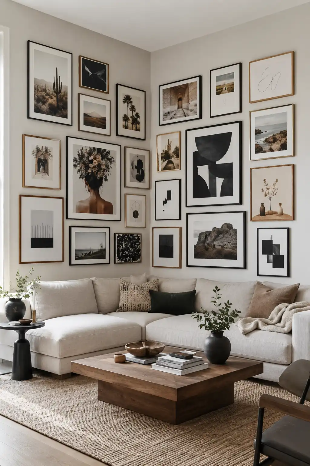
A corner gallery becomes more visually interesting when realistic photography is paired with bold abstract artwork. The contrast between landscapes, architectural photographs, portraits, and graphic compositions gives the collection a contemporary character while keeping the eye moving across both walls.
The trick is to create a common thread between pieces that look different at first glance. In this arrangement, black, white, beige, and warm wood tones connect the artwork, while a few gold frames add subtle variation. Mixing portrait and landscape orientations also keeps the gallery from feeling too rigid or repetitive.
This approach works particularly well in a modern living room because it adds personality without relying on excessive decoration. The neutral sectional and wooden coffee table provide a calm foundation, allowing the artwork to carry most of the visual interest. A few carefully chosen accessories can then reinforce the colors already present in the gallery.
Pro Tip: Pair bold abstract pieces with quieter photographs so the strongest artwork has room to stand out rather than competing with everything around it.
8. Create a Precise Grid of Architectural Photography
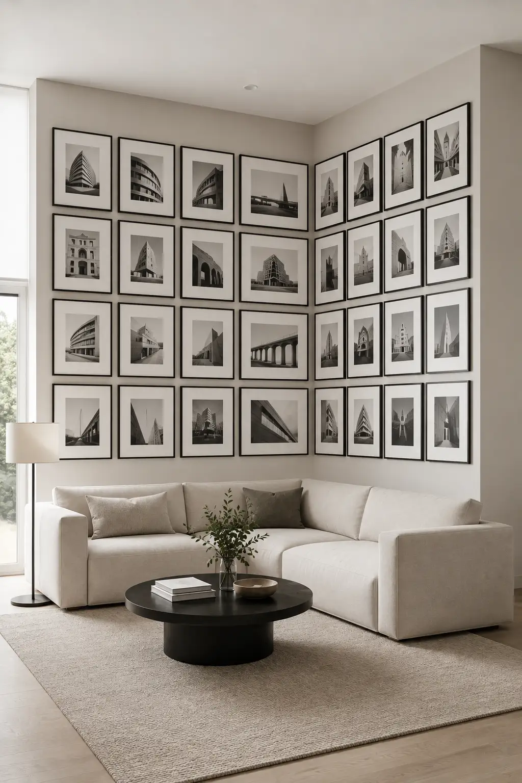
A structured grid can give a corner gallery a crisp, architectural feel. Use matching frames and arrange the artwork in clearly defined rows and columns across both walls. When the spacing stays consistent, the corner becomes part of the geometry rather than interrupting the composition.
Architectural photography works especially well with this approach because the artwork itself reinforces the clean lines of the arrangement. Choose buildings, bridges, interiors, and distinctive structures photographed in a similar black-and-white or monochromatic style. Keeping the visual treatment consistent makes a large collection feel unified.
This layout suits modern rooms where clean lines and understated furniture already play an important role. A simple sectional, round coffee table, and neutral rug can provide enough contrast without distracting from the gallery. The result is orderly, sophisticated, and particularly effective in a spacious corner.
Pro Tip: Measure the wall and mark your frame positions before hanging anything so every row stays aligned and the spacing remains consistent around the corner.
9. Turn Family Memories Into a Warm Corner Gallery
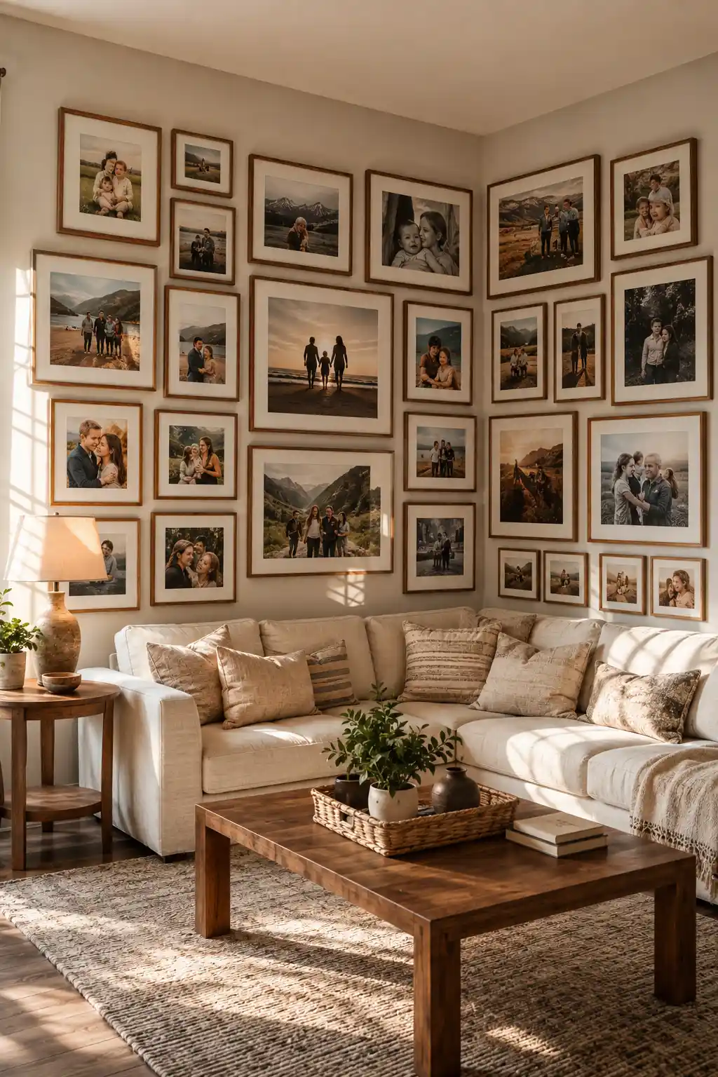
A family photo gallery can make a corner feel personal while still looking polished and thoughtfully designed. Instead of keeping favorite photographs in albums or scattered around the home, bring them together in one cohesive display that tells a visual story. Wrapping the photographs around the corner makes the collection feel larger and more immersive.
Choose photographs from different moments, such as family trips, celebrations, everyday memories, and outdoor adventures. Mixing portrait and landscape images adds variety, while matching wooden frames give the collection a warm, unified appearance. Keep the overall color treatment reasonably consistent so the photographs feel like part of one collection.
This idea works especially well in a comfortable family living room where the gallery can become a meaningful backdrop for everyday life. Warm wood furniture, soft upholstery, woven textures, and natural light complement the photographs beautifully. Rather than looking like a formal art display, the corner feels welcoming, lived-in, and full of character.
Pro Tip: Select photographs that share a similar warmth or editing style so different memories still look cohesive when displayed together.
10. Make a Bold Statement With Oversized Abstract Artwork
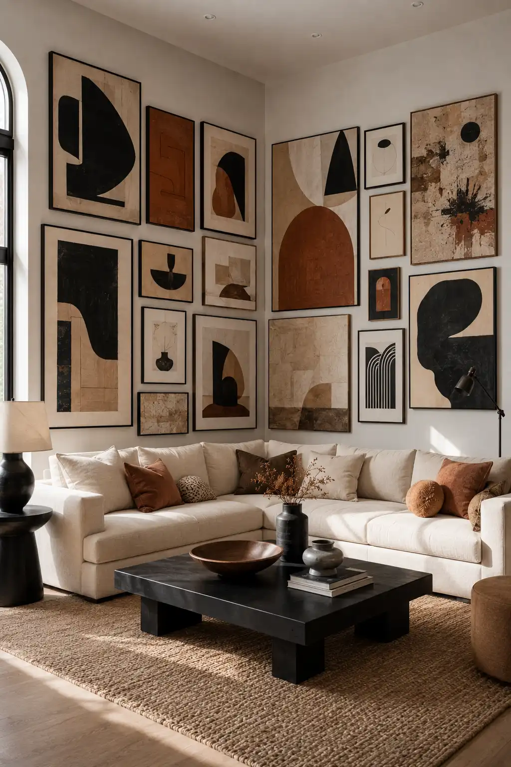
An abstract corner gallery can turn an ordinary living room into a striking contemporary focal point. Instead of relying on photographs or traditional artwork, build the collection around bold geometric forms, expressive shapes, and strong visual contrasts. The artwork immediately gives the corner a more curated and artistic presence.
Use a controlled palette such as black, warm white, terracotta, tan, and deep brown so the collection feels connected even when each piece has a different composition. Combine oversized statement pieces with smaller abstract prints to create variation in scale. Leaving some breathing room between the strongest pieces can also help each artwork maintain its individual impact.
The surrounding furniture should stay relatively simple so the gallery remains the visual centerpiece. Neutral upholstery, a dark coffee table, natural textures, and a few sculptural accessories can echo the shapes and tones found in the artwork. With the right balance, the corner feels modern and expressive without becoming visually overwhelming.
Pro Tip: Choose one dominant accent color from your artwork and repeat it subtly in cushions or accessories to make the entire room feel intentionally designed.
11. Follow the Staircase With an Artful Gallery Arrangement
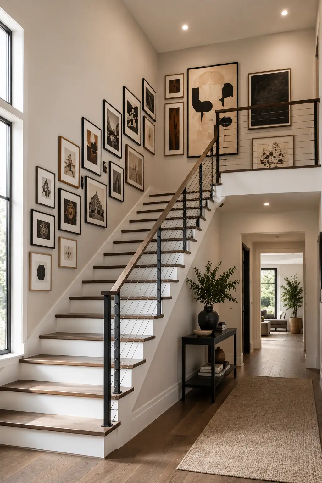
A staircase wall offers a natural path for a gallery because the architecture already guides the eye upward. Instead of arranging artwork in a conventional rectangle, follow the angle and movement of the stairs with a collection that gradually rises toward the landing. This makes an otherwise transitional area feel designed and purposeful.
Mix portrait and landscape frames while keeping the artwork connected through a consistent color palette. Smaller pieces can follow the lower portion of the staircase, while larger artworks become more prominent as the arrangement approaches the upper landing. Extending a few pieces onto the landing wall helps the gallery feel continuous rather than stopping abruptly.
Pay attention to the surrounding architecture when planning the layout. Keep artwork clear of the handrail and walking path, and leave enough space around doors, trim, and other structural details. A restrained combination of black, wood, and neutral frames works particularly well in modern staircases where the artwork should complement rather than compete with the architecture.
Pro Tip: Lay out the frames on the floor in a staircase-shaped arrangement first, then adjust the spacing before transferring the design to the wall.
12. Create a Dramatic Salon-Style Gallery Across Two Walls
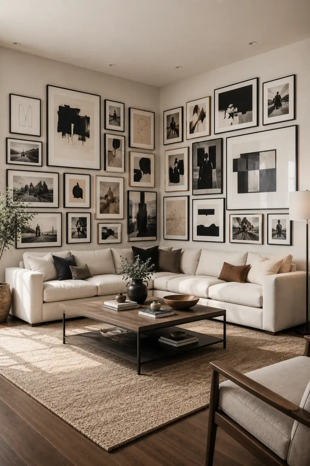
A salon-style gallery brings a collected, art-forward feeling to a large corner by combining different artwork sizes, orientations, and compositions. Rather than arranging every frame in a strict grid, allow the pieces to vary while keeping the overall display visually balanced. This makes the corner feel layered and expressive without looking overly formal.
Use a mixture of photography, abstract artwork, sketches, and graphic compositions, with a few larger pieces acting as anchors. A restrained palette of black, cream, beige, and muted brown helps connect the different styles. Keeping the frames relatively consistent also gives the collection enough structure while allowing the artwork itself to provide variety.
This arrangement works especially well above a large sectional because the broad furniture provides a strong horizontal foundation for the gallery. Extend the artwork across both walls and let the composition wrap naturally through the corner. The result is a dramatic focal point that gives the living room the character of a thoughtfully curated private gallery.
Pro Tip: Start by placing your largest three or four pieces first, then fill the gaps with smaller artwork while keeping the overall outer edges visually balanced.
Conclusion
A corner wall gallery can completely change the character of a room by turning an overlooked architectural feature into a deliberate focal point. Whether you prefer a precise grid, a neutral collection, botanical artwork, family photographs, or bold abstract pieces, the strongest arrangements balance variety with a clear visual connection. The corner itself can become part of the composition rather than simply being the place where two walls meet.
The best gallery walls also work with the furniture, lighting, and overall mood of the room. Start with a clear focal point, repeat a few colors or frame finishes, and give each artwork enough room to breathe. With thoughtful placement and a little planning, even an ordinary corner can become one of the most memorable details in your home.
